ArcGrow · SaaS · 2025–2026
Architecture project
management, redesigned.
Role
UI/UX Designer
Timeline
Aug '25 – Feb '26
Platform
Web — SaaS
Skills
UX Research · Design System · Figma
What is ArcGrow?
ArcGrow is a project management tool built specifically for architectural teams. Architectural projects are long, complex, and involve many people, files, and decisions across months or years.
Most project tools feel generic — they don't match how architects actually work. ArcGrow aimed to change that. I joined as a UI/UX Designer working across UX research, competitor analysis, UI screens, dashboard layouts, and design system implementation.
One question drove everything
Architects constantly struggled to answer one basic question: "What is happening in my project right now?" Status was scattered across WhatsApp, emails, phone calls, and spreadsheets. Nothing connected.
No single status view
Project health was scattered. Checking progress meant calling people or digging through chat histories.
Disconnected tasks
Notes in WhatsApp, tasks in spreadsheets, decisions in emails. Context was constantly lost.
Complex role access
Architects, engineers, and clients all needed different views. Generic tools failed all three equally.
Poor document flow
Architectural projects involve dozens of files. Email attachments constantly broke collaboration.
Competitor study and key insights
I studied similar project management tools — analysing structure, layout patterns, and navigation. The consistent finding: most tools tried to show everything, which increased cognitive load and made status harder to find.
ArcGrow had to be different. Fewer elements. Clearer priorities. Show what matters most, remove what doesn't.
Research & Competitor Analysis
Clarity first, features second
Instead of showing everything, I prioritised essential information, clear hierarchy, and a calm visual layout. Every decision was filtered through one question: does this make the current status clearer?
Three users, one consistent system
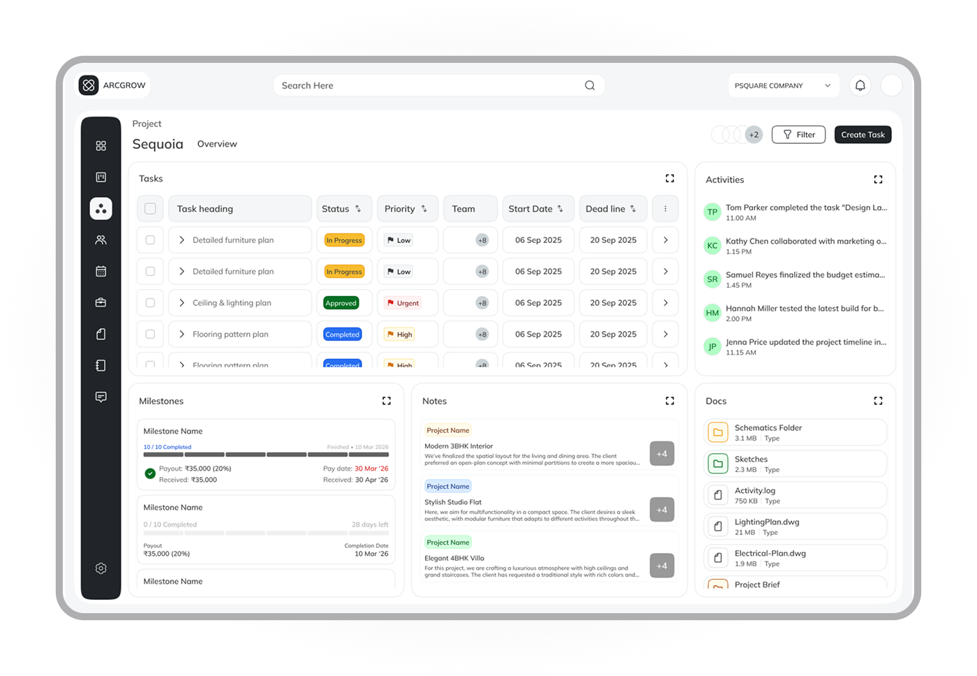
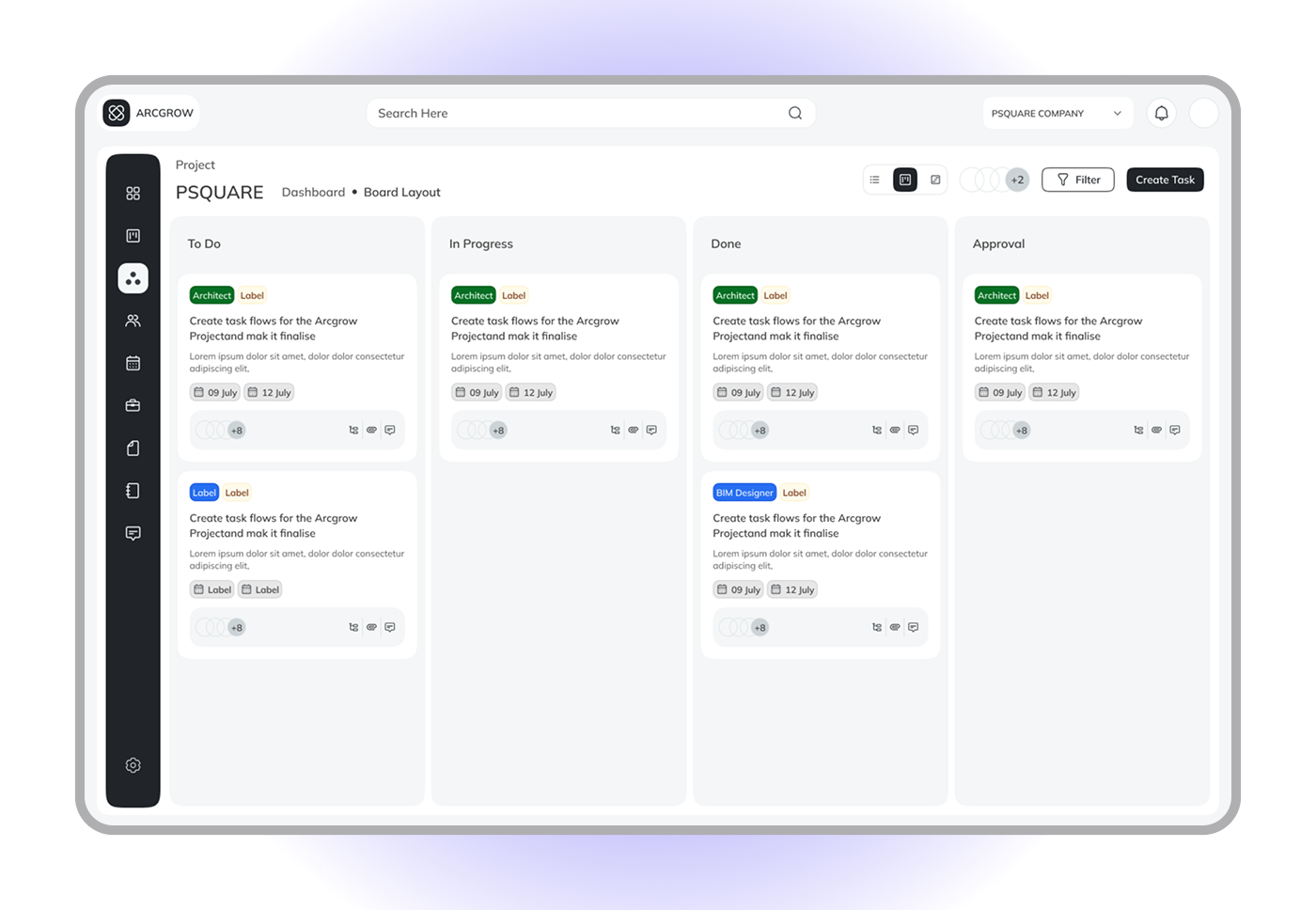
ArcGrow had three user types — Project Managers, Employees, and Clients. I designed a separate dashboard view for each role while keeping global navigation and visual language consistent across all three.
Project Manager
High-level project health, timelines, team status. Designed for oversight and fast decision-making.
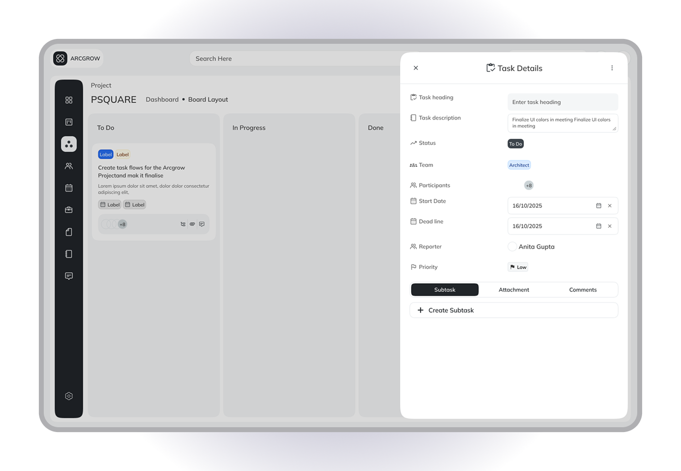
Employee / Engineer
Task list, priority queue, quick status updates. Minimum taps to log progress — built for field use.
Client
Clean progress summaries and milestone updates. No internal noise — only what the client needs.
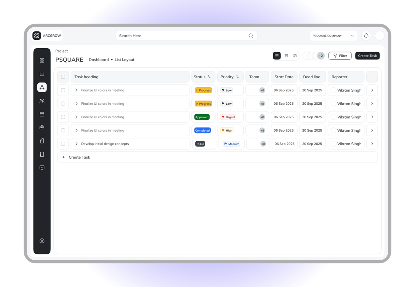
Speed and clarity over features
Tasks support list view for scanning and board view for workflow. Each task clearly shows status, ownership, and priority. The goal was never more features — it was making common actions effortless.
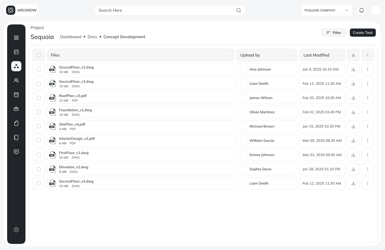
A document system built into the product
Architects work with dozens of interconnected files. ArcDocs explored a drive-like system — structured folders, project-linked files, role-based sharing. The goal was to cut tool-switching and keep all context in one place.

Building once, using everywhere
As the product grew, I applied design system principles — reusable components, consistent spacing, scalable patterns. This improved design speed, visual consistency, and made developer handoff significantly cleaner.
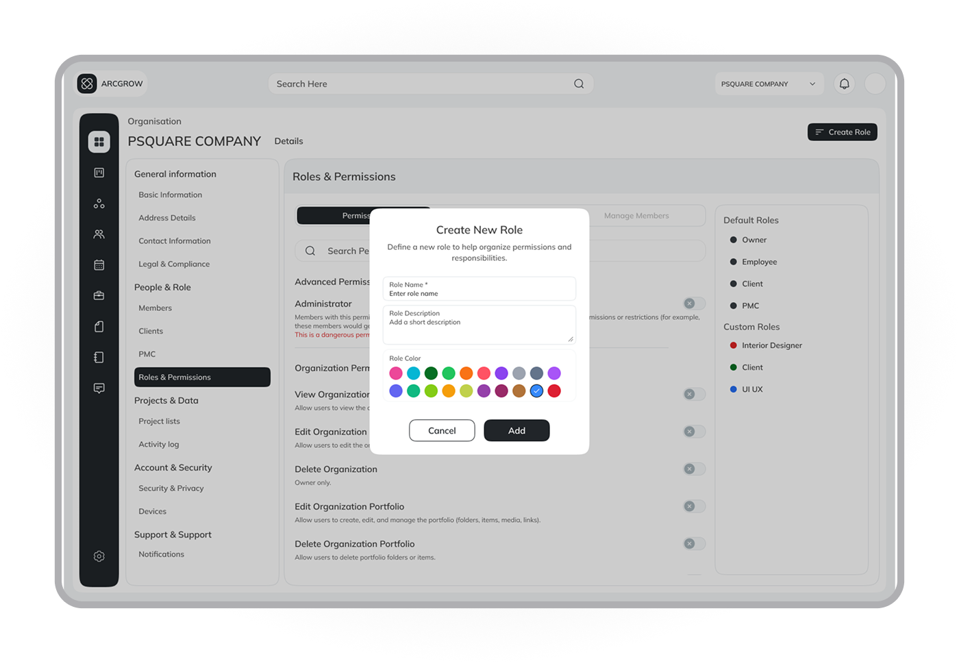
Design System & Components
What the project achieved
ArcGrow became more structured and focused. The work helped clarify project status for all user types, supported role-based access cleanly, and gave the team a unified design system to build from.
3
Role-based dashboard views designed
1
Unified design system across all surfaces
↑
Project status clarity — core goal
What I took away
Clarity matters more than features. Dashboards are about priorities, not data. This project helped me grow from designing screens to designing systems — with real constraints, real feedback, and real responsibility.
Research is not a checkbox. Insights from early conversations with architects shaped every significant design decision made over six months.