Textbook · EdTech · Concept Project
UPSC learning that feels like
guidance, not pressure.

Role
UX/UI Designer
Type
Concept Project
Platform
Mobile App
Skills
UX Research · IA · UI Design · Figma
What is Textbook?
Textbook is a mobile learning platform for UPSC aspirants. UPSC preparation is long, stressful, and often lonely. Most students start strong — but over time, confusion grows and motivation quietly fades.
I wanted to design a product that feels like guidance, not pressure. I handled the full process: research, information architecture, user flows, and UI design.
The issue wasn't content — it was overload
The syllabus is enormous. Content is scattered across YouTube, PDFs, notes, and apps. Doubts go unanswered for days. Progress feels invisible. So motivation slowly fades.
I reframed the core question: "How do we help aspirants feel guided, confident, and motivated every single day?"
Endless syllabus
Without structure, students don't know where to start. The volume alone is paralyzing.
Invisible progress
Students studied for months with no sense of how far they'd come. Motivation quietly died.
Unanswered doubts
Asking a mentor meant waiting days. Late-night doubts accumulated into blockers.
No daily direction
Most platforms just deliver content. They don't tell you what to study today.
Finding the gaps
I studied Drishti IAS, Padh AI, Super Kalam, and Unacademy. Most focus on live classes and content volume. But navigation feels crowded and there's no sense of personal progress.
The real gap wasn't content — it was structure, direction, and reassurance.
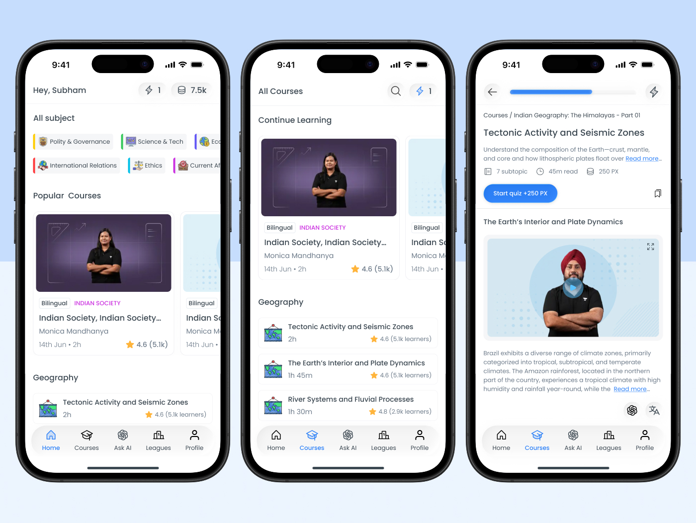
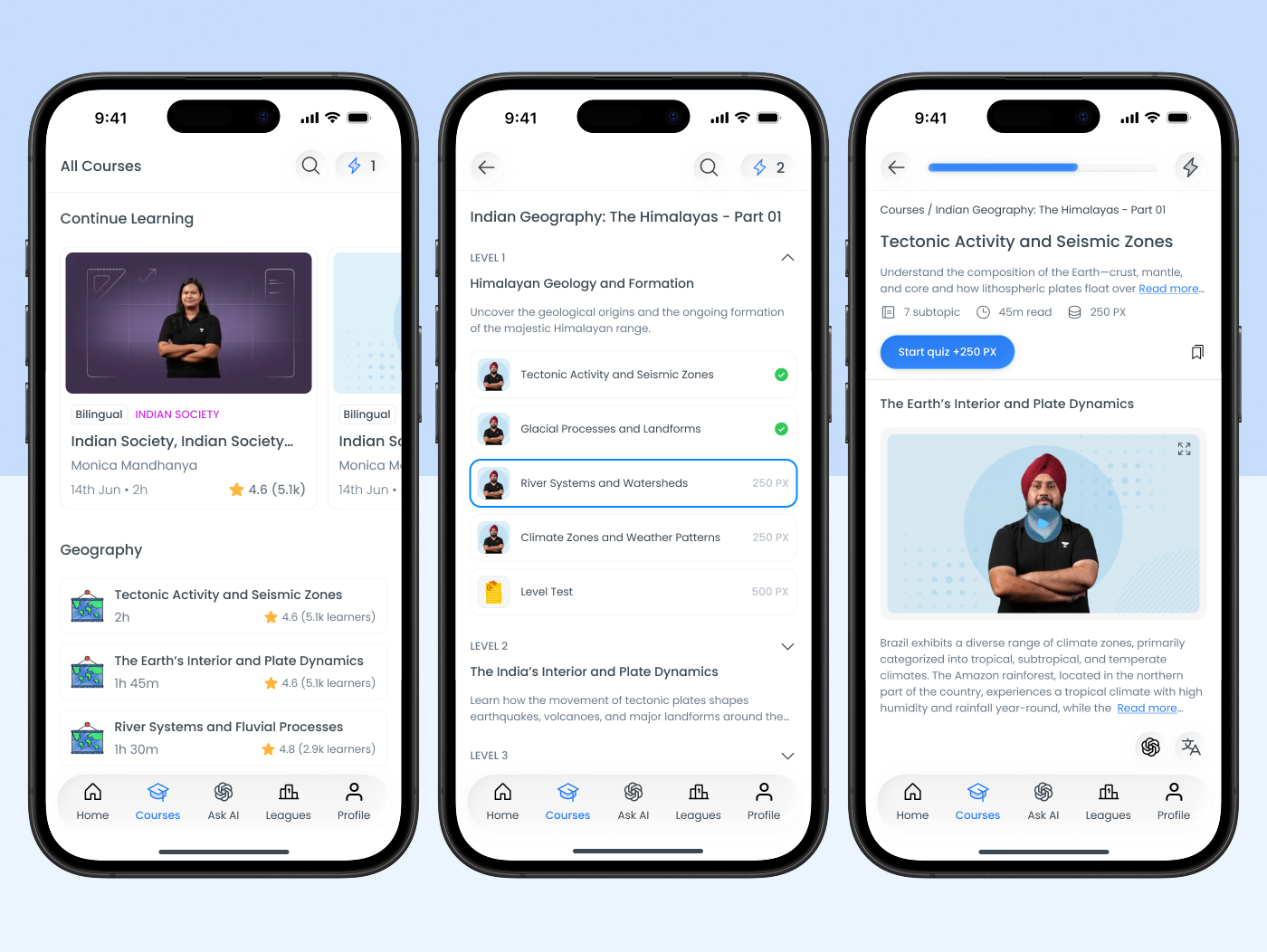
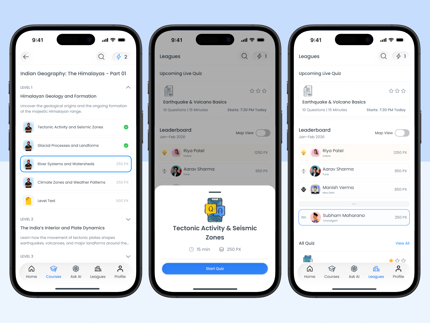
Subject → Chapter → Topic
I broke the UPSC syllabus into three clear layers. No deeper, no shallower. This created a manageable mental model and clear moments of completion at every level.
Three-layer syllabus
Subject → Chapter → Topic. Enough structure to feel guided without creating new overwhelm.
Daily study plan
Home screen answers three questions: what to study today, how far you've come, what comes next.
Visible progress
Completion bars, streaks, and a visual journey map at every level. Always visible.
Open → study → complete → feel it
Every screen decision was about making the core loop as short and satisfying as possible: open app → see today's task → study → complete → feel progress.
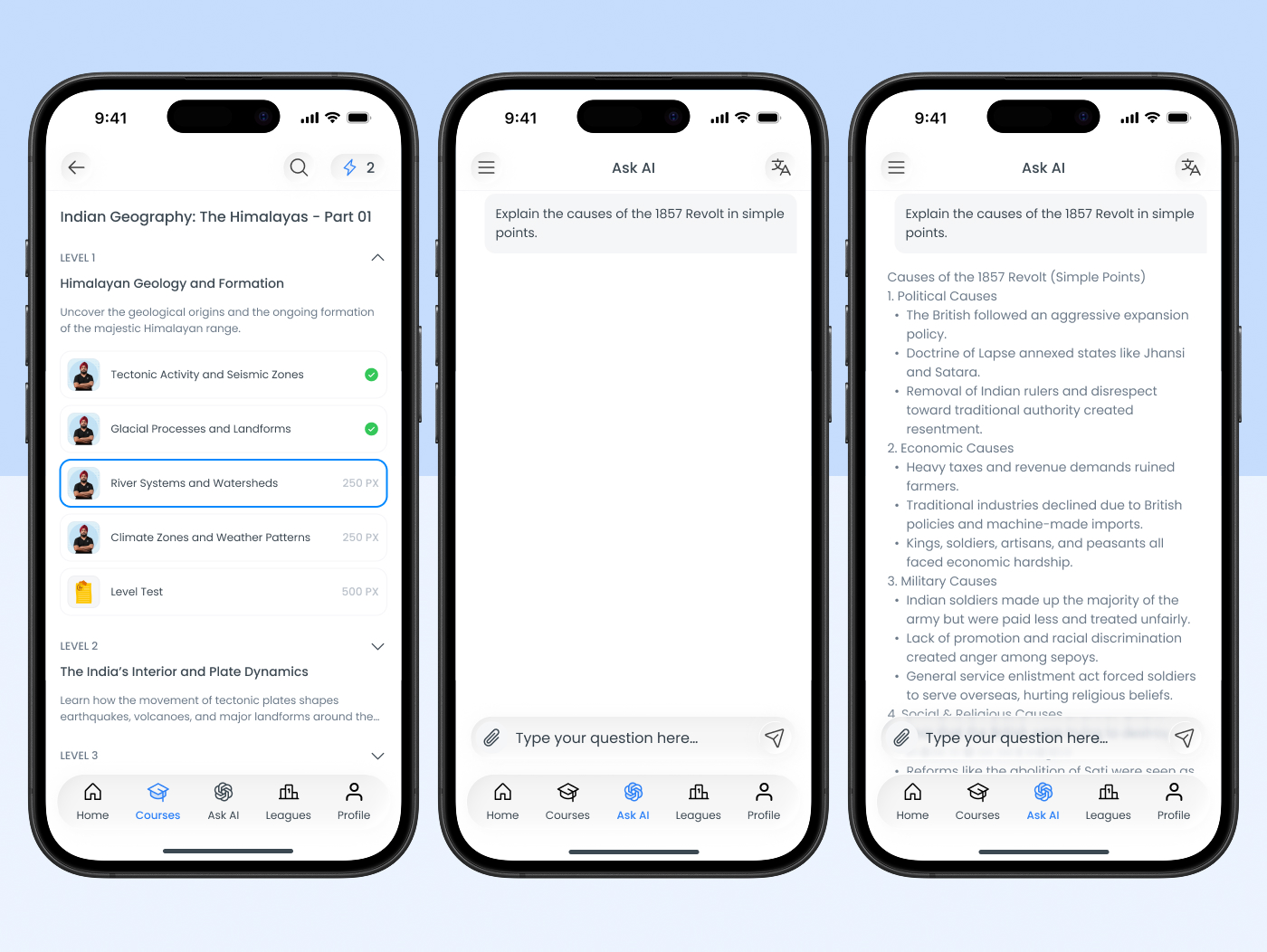
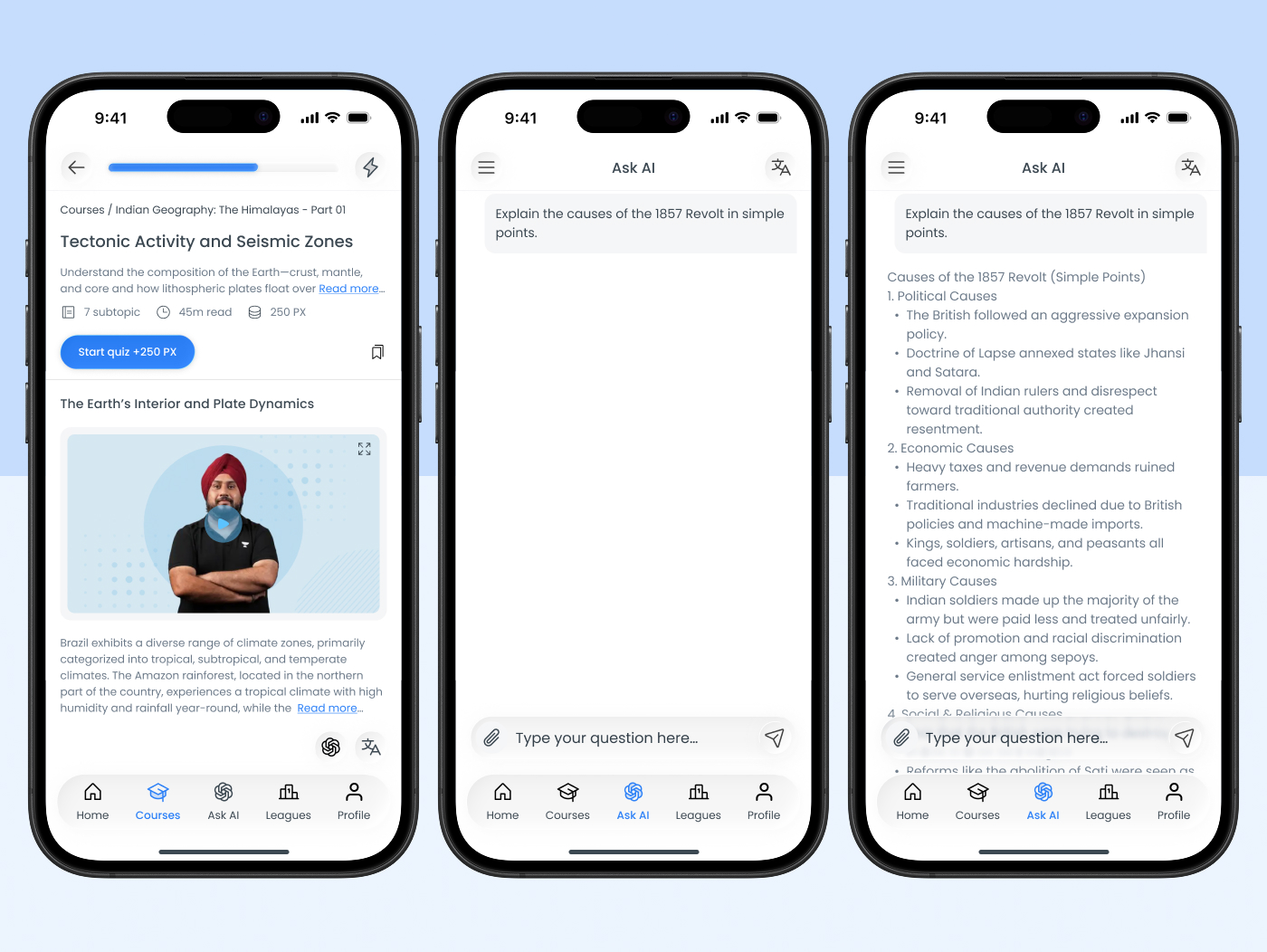
AI added only where it actually helps
I added AI only where users struggled most — doubt resolution. Ask doubts anytime, get simple explanations, study in bilingual mode (Hindi and English). It doesn't replace mentors. It handles the doubts that can't wait.
Making progress impossible to miss
Motivation fades quietly. I made progress visible at every level — streaks, daily points, topic completion, and level milestones. This isn't competition. It's self-accountability.
What was designed
I designed the main dashboard and learning flow. The result is visually calm, easy to scan, and minimal but informative. Users immediately see what they're studying, where they are, and what comes next.
3
Syllabus layers — clear structure
3
Questions answered on the home screen
2×
Bilingual AI — Hindi and English
What I took away
Education design is emotional design. Students don't just need information — they need support, structure, and a daily sense of moving forward.
Good design doesn't make users feel smart. It makes them feel supported. That was the goal here, and it shaped every decision from IA to the smallest UI moment.