Prana · E-Commerce · 2024–2025
E-commerce for park homes,
built on trust.
Role
UX/UI Designer + PM
Timeline
Sept 2024 – Feb 2025
Platform
Web + Mobile
Client
Prana Leisure Group
What is Prana?
Prana Leisure Group is a UK property platform for buying, renting, and selling caravans, lodges, and park homes — a high-consideration market where trust is the product.
Client
Prana Leisure Group
My Role
UX/UI Designer + Project Lead
Platform
Web + Mobile
Delivered
Feb 2025 · Phase 1
I owned end-to-end design across three systems — the public buyer-facing platform, a self-serve Property Management System for owners, and a Superadmin dashboard for Prana's internal team — while managing the UK client relationship and developer handoff simultaneously.
UI Showcase
Platform demo — buyer experience walkthrough
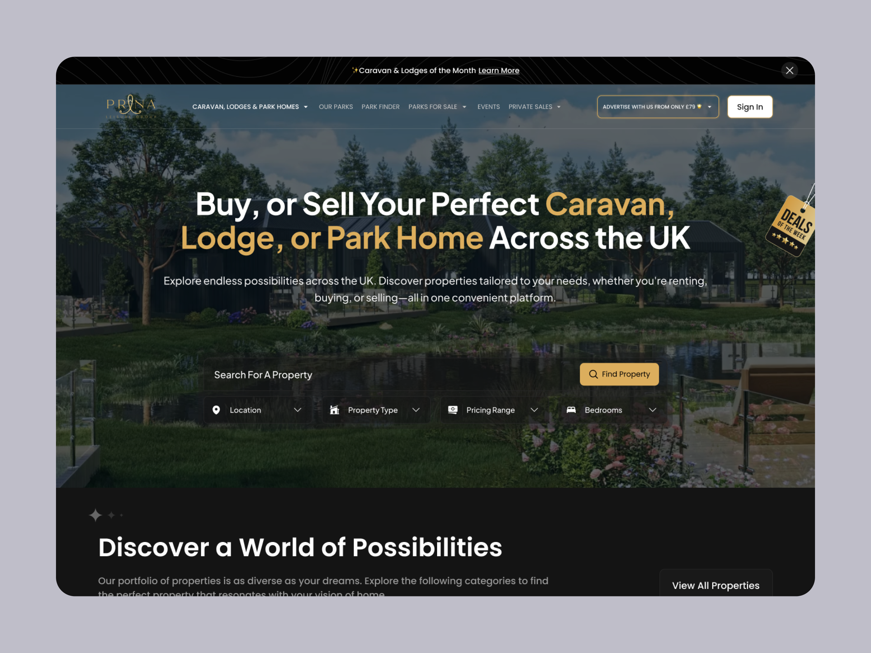
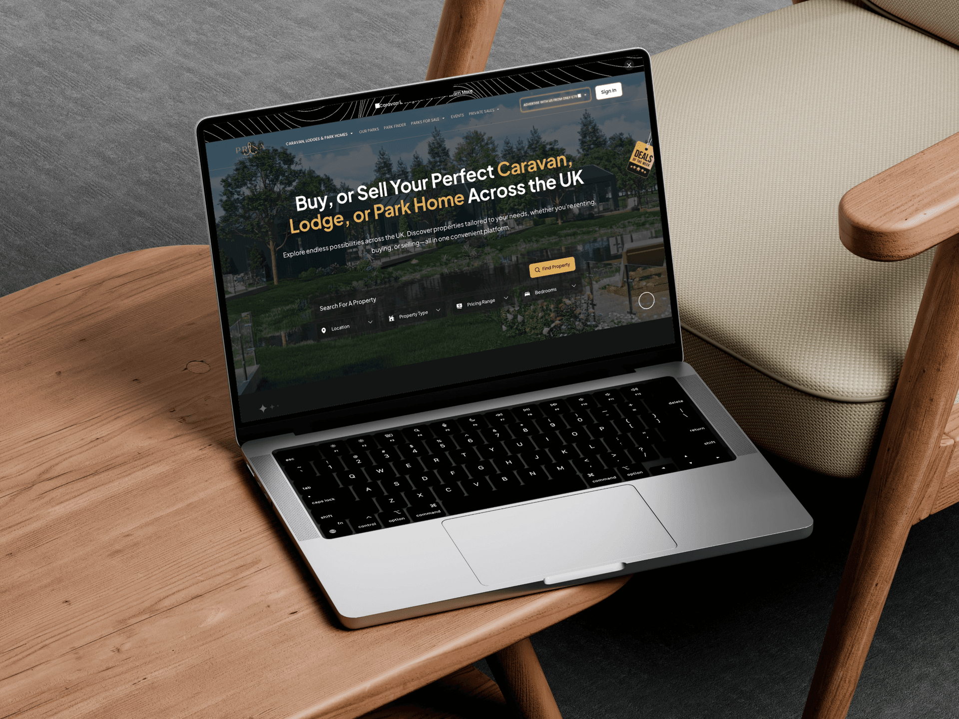
Homepage — hero search & discovery
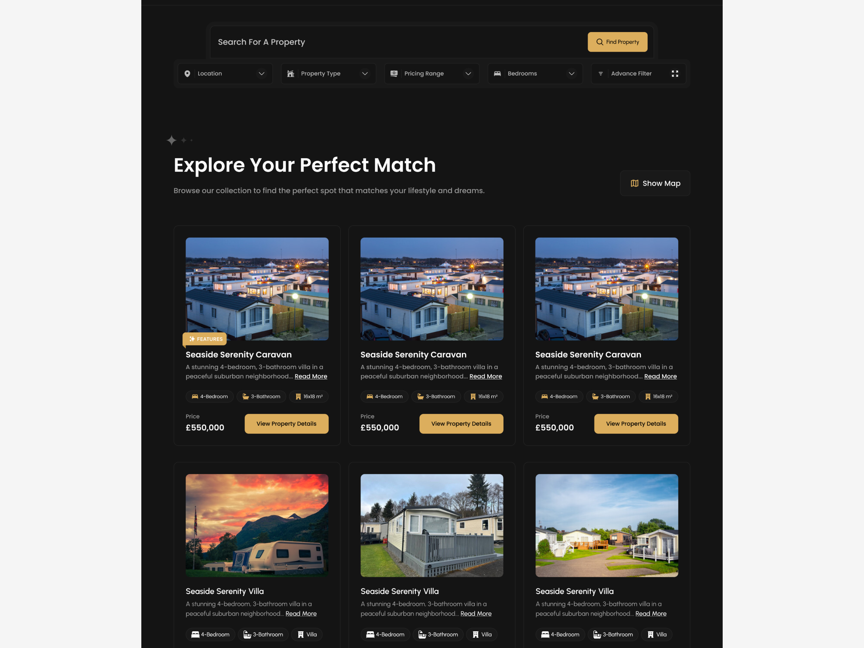
Listings grid — filter bar & property cards
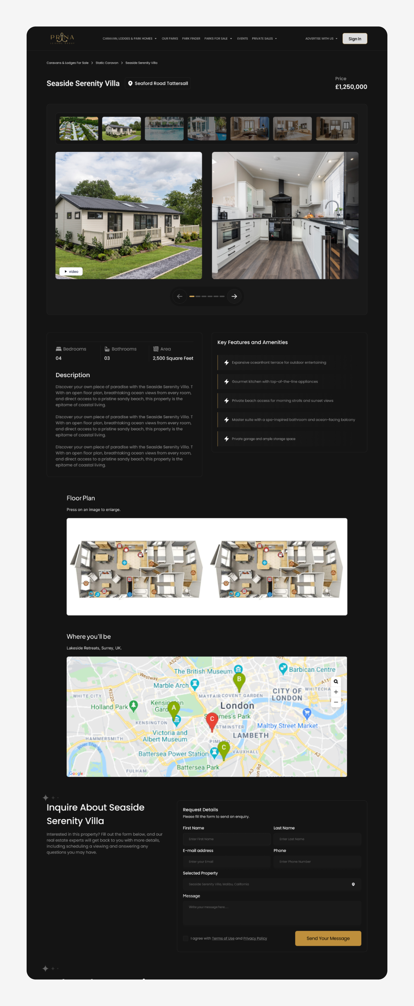
Property detail — gallery, specs & trust signals
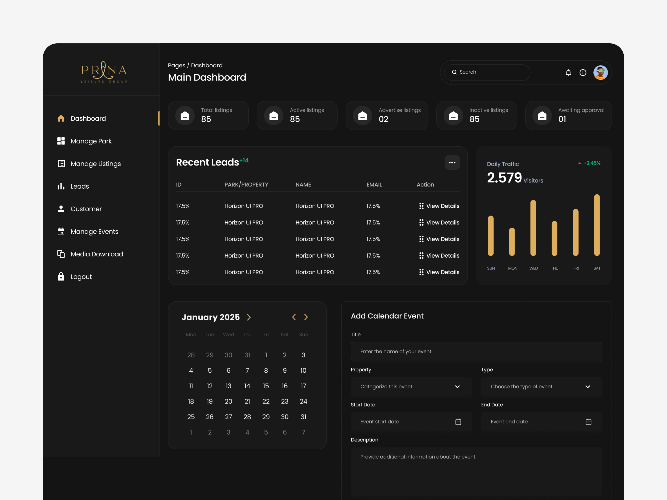
Owner dashboard — KPIs, leads & traffic
Want the full picture?
Dive into the research process, every screen decision, and the complete 6-month engagement breakdown.