The Healing Dawn · Visual Design · UI Redesign · Wellness
Website Redesign,
earned through craft.
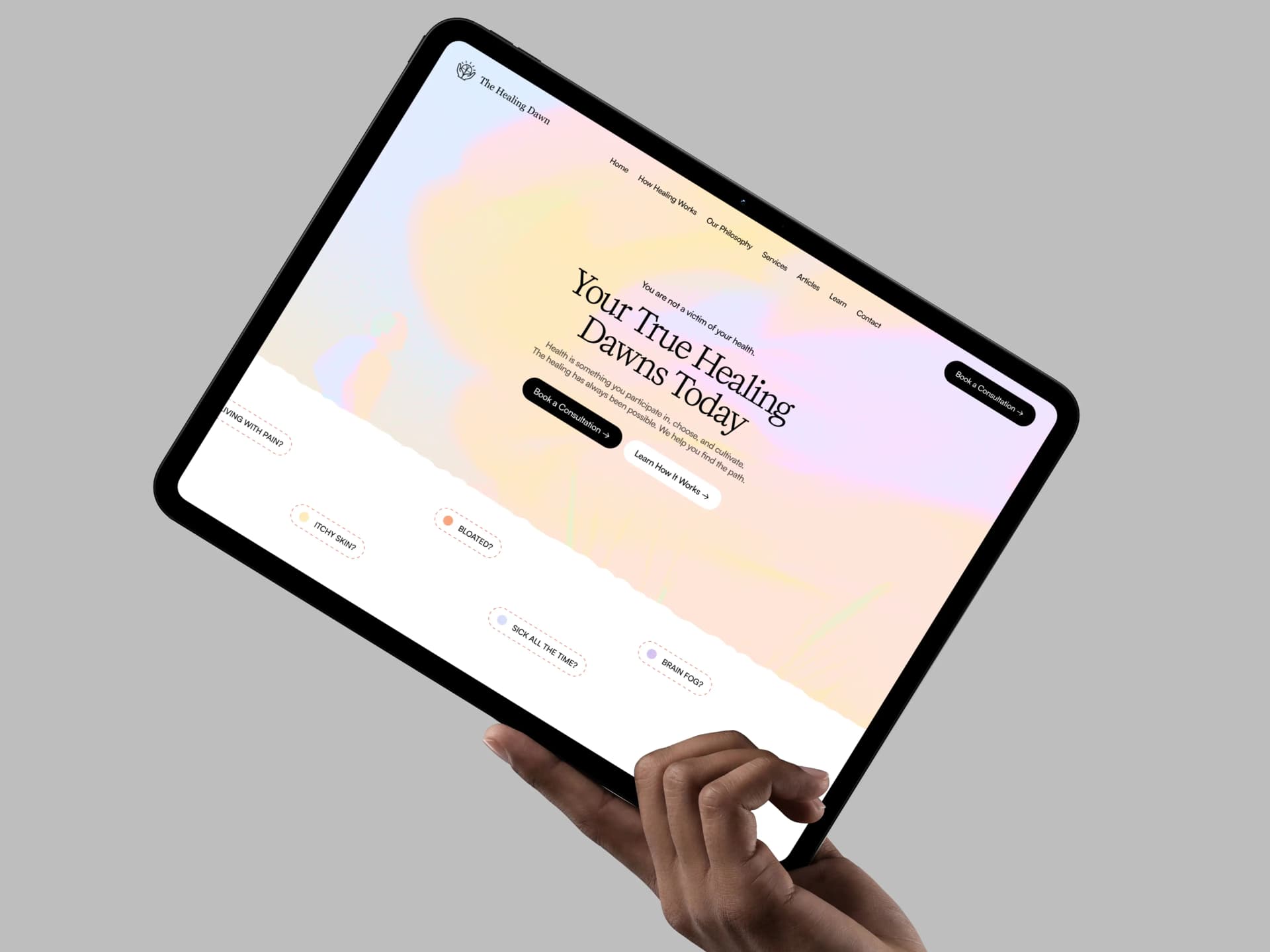
What is The Healing Dawn?
The Healing Dawn is a wellness practice focused on whole-person healing — body, soul, and spirit. Their existing website felt generic and impersonal: the visual output of an AI template rather than a considered brand. It failed to reflect the depth and premium nature of the service, or connect emotionally with people who come to the practice in genuine need.
Role
UI Designer
Agency
Caliper Design
Duration
Under 1 week
Tools
Figma
Caliper Design was brought in to lead a visual redesign. My manager defined the creative direction and designed the homepage. I was responsible for designing the remaining three core pages — independently extending the visual language across the full site.
What the Original Site Got Wrong
The original site had two fundamental visual failures that undermined the brand's credibility:
Generic AI Aesthetics
The look and feel was templated — no distinct personality, no visual warmth. It could have been any wellness brand. Nothing communicated the depth or care of the actual practice.
Lack of Premium Presence
The visual hierarchy and typography didn't communicate care or craft — qualities essential for a practice asking people to trust their healing journey to it.
"A wellness brand must earn trust before it earns a client. The design is the first conversation."
Premium, Spiritual, and Grounded
The visual language was anchored in a warm tonal palette — soft terracottas, dusty mauves, and natural creams — evoking warmth and restoration without clinical sterility. Typography combined editorial serif display fonts with clean body text to balance soul with structure.
The direction, set by my manager on the homepage, guided four core principles I extended across every subsequent page:
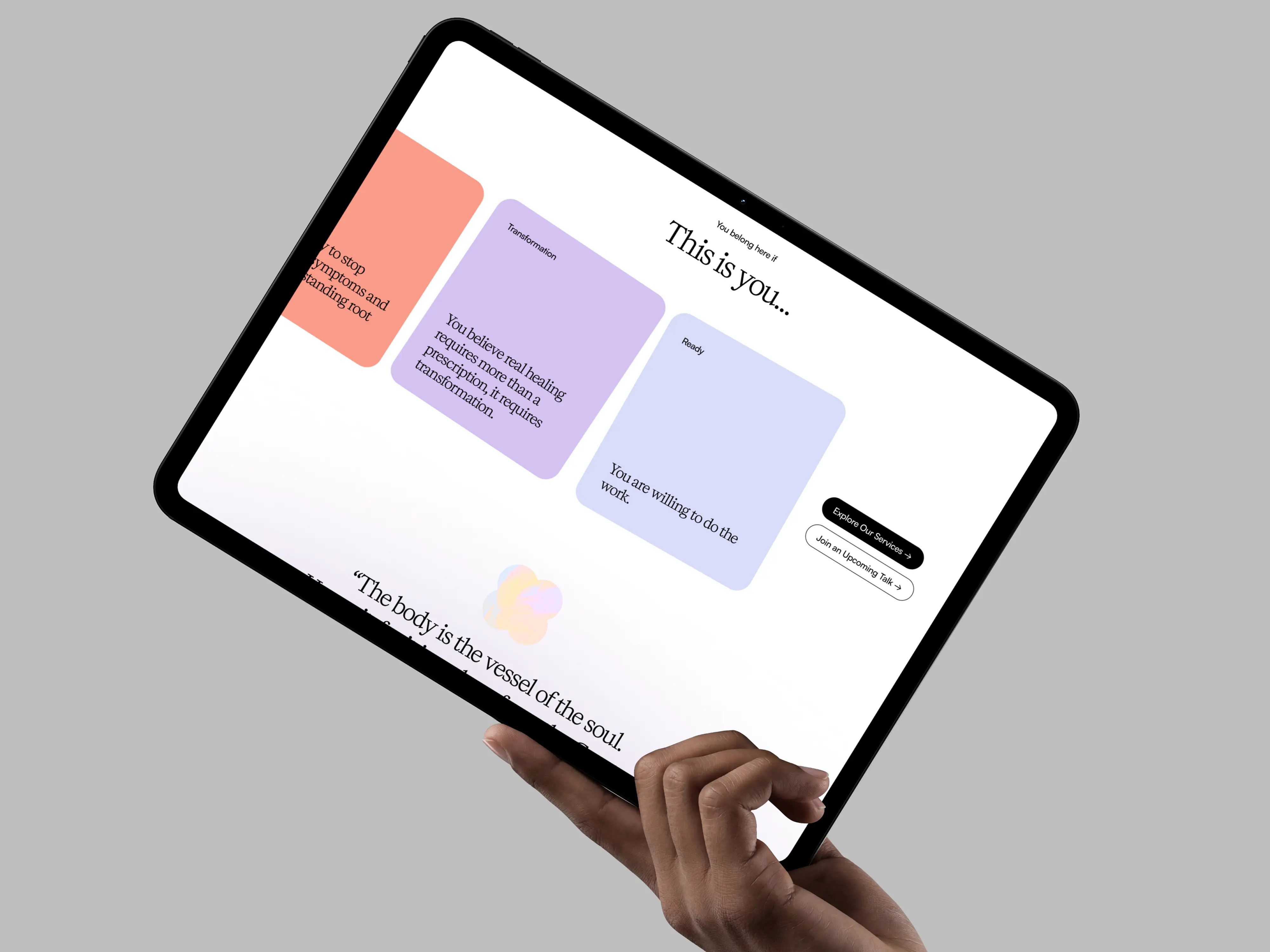
Warm tonal palette — soft terracottas, dusty mauves, natural creams. Typography balances editorial serif with clean body text.
Pages I Designed
Working from the homepage template set by my manager, I independently designed three pages — each requiring me to interpret and extend the visual system across new content structures and user intents.
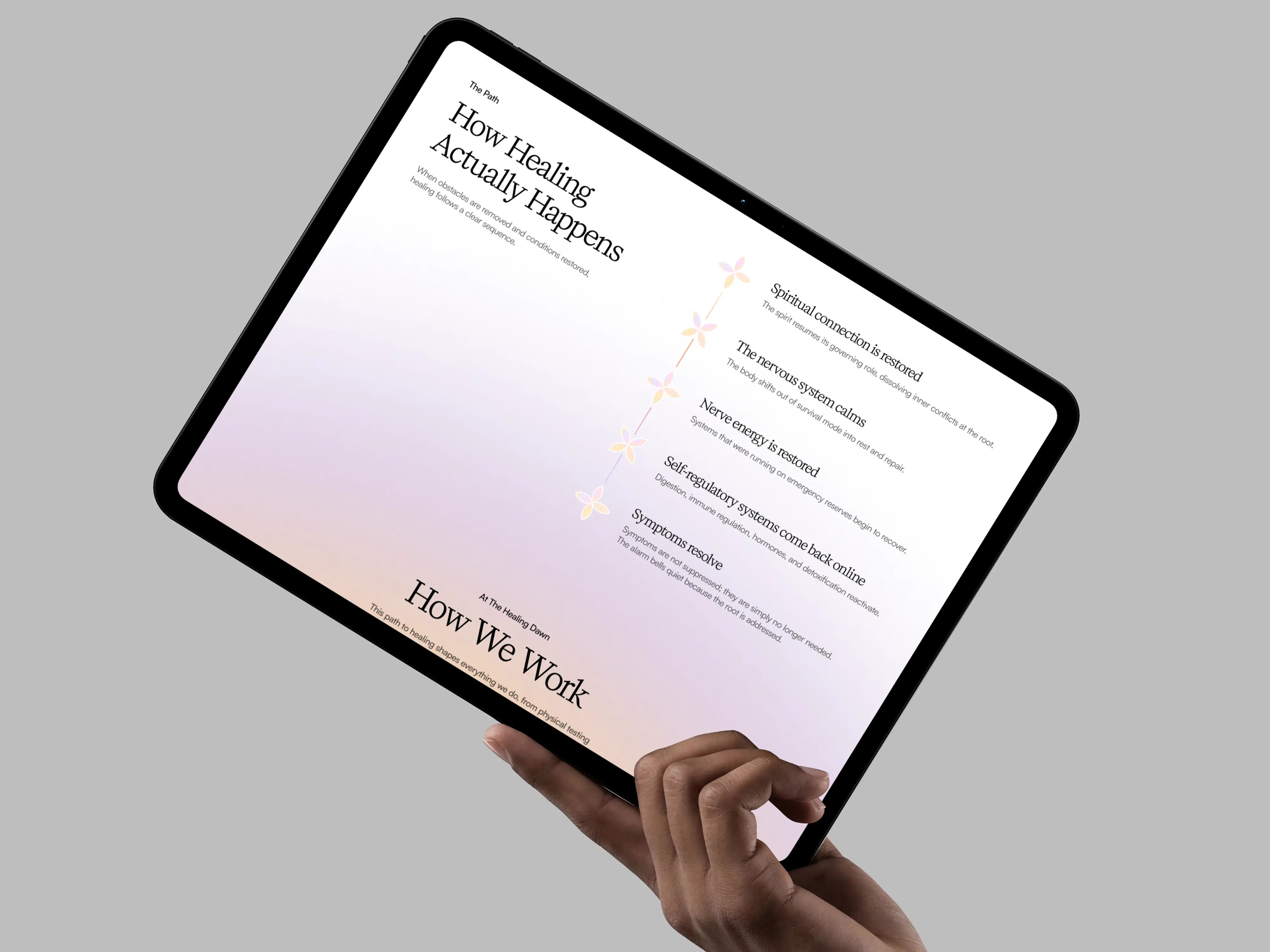
How Healing Works
Required translating dense, educational content about the body's self-healing systems into a visually clear, calm layout. I used contrast diagrams (Depleted vs Strong Nerve Energy) and structured section spacing to guide readers through complex ideas without overwhelm.
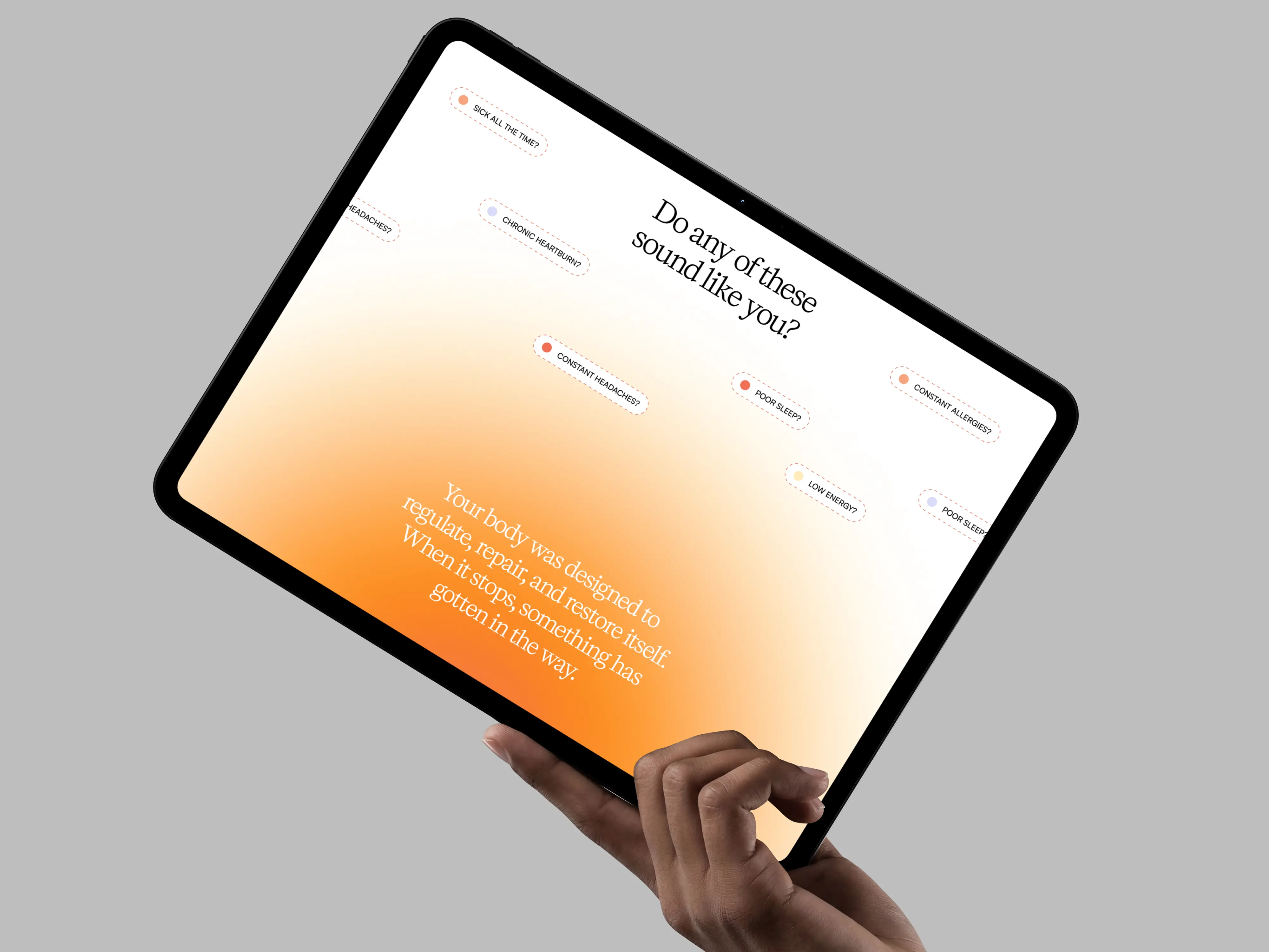
How Healing Works — educational content structured with contrast diagrams and generous section spacing.
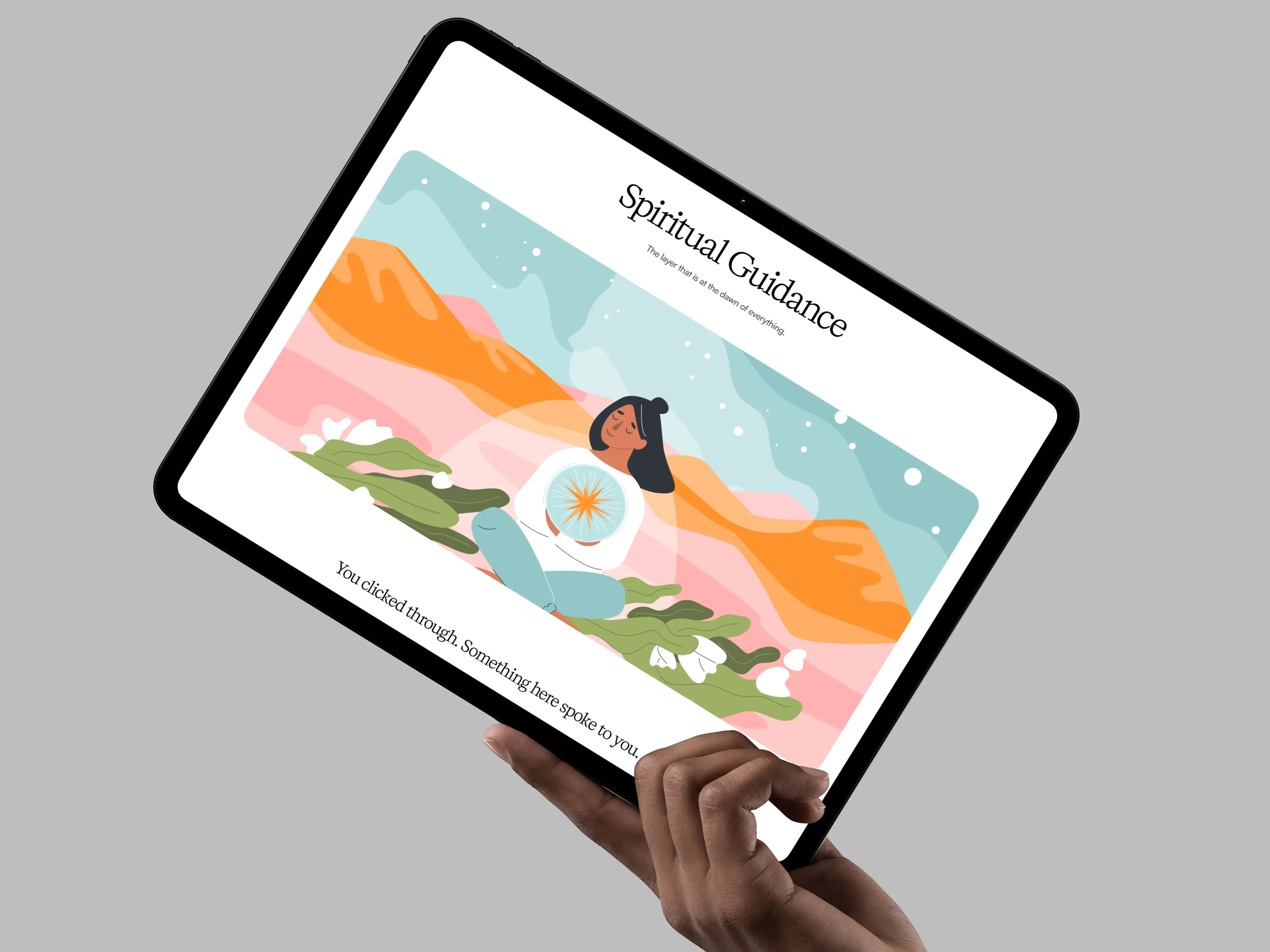
Spiritual Guidance
The most emotionally sensitive page on the site. Designed to feel like an invitation rather than a sales page. I used full-bleed atmospheric imagery, centered italic typography, and deliberate pacing through vertical rhythm to create an unhurried, introspective tone.
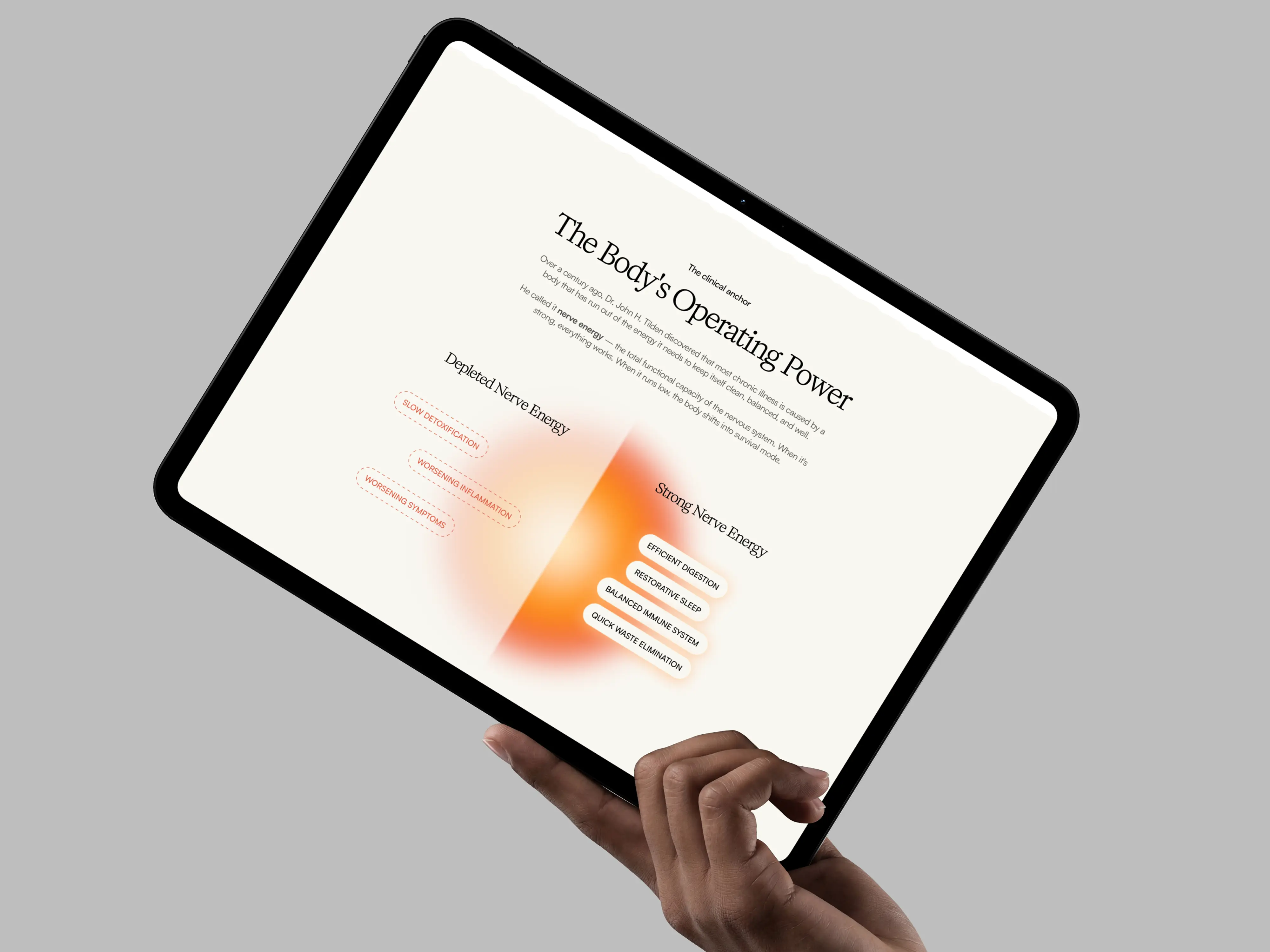
Spiritual Guidance — full-bleed atmospheric imagery, centred italic typography, deliberate vertical pacing.
Contact — Begin the Conversation
Reframed a functional form page as an emotionally warm entry point. Instead of a standard contact form, the layout leads with the message "Begin the Conversation" — reducing anxiety and aligning the form's feel with the brand's healing ethos.
Contact page — reframed as 'Begin the Conversation'; form layout designed to reduce anxiety, not trigger it.
Design Thinking in Practice
Extending a system, not starting fresh
My core challenge was consistency — every page had to feel like the same brand without being given an explicit design system. I studied the homepage closely to extract spacing logic, type scale, and colour usage before designing a single frame.
Copy-driven layouts
The Healing Dawn's content is rich and meaningful. I designed layouts that let the words breathe — avoiding visual clutter that would compete with the copy rather than support it.
Emotional design over decoration
Every visual decision — image choice, section dividers, headline sizing — was evaluated for how it would make a vulnerable person feel. Warmth and safety were the filters.
Information hierarchy on complex pages
The 'How Healing Works' page contains layered medical and philosophical concepts. I structured the content with clear visual anchors so readers could navigate it intuitively without feeling lost.
Extending the visual system — spacing logic, type scale, and colour usage extracted and consistently applied across all three pages.
What Was Delivered
Within under a week, three fully designed pages were handed off that extended the homepage visual system coherently. The redesigned site elevated The Healing Dawn from a generic digital presence to one that reflects the depth and care of the practice itself.
4
Pages redesigned in total
<1wk
End-to-end turnaround
3
Pages I owned solo
1
Agency. Caliper Design.
What I Learned
This project was my first real experience working within an established creative direction rather than building one from scratch. It taught me that extending a design system is its own discipline — it requires deep observation, restraint, and trust in the original vision even when you might want to explore differently.
Working within an established creative direction sharpened my ability to make confident, on-brand decisions quickly. Even within a short engagement, the work I produced across three pages is something I’m genuinely proud of — and it demonstrates that good execution and creative judgement aren’t mutually exclusive.
Extending a design system is its own discipline — it requires deep observation, restraint, and trust in the original vision.